
[adinserter block=”2″]
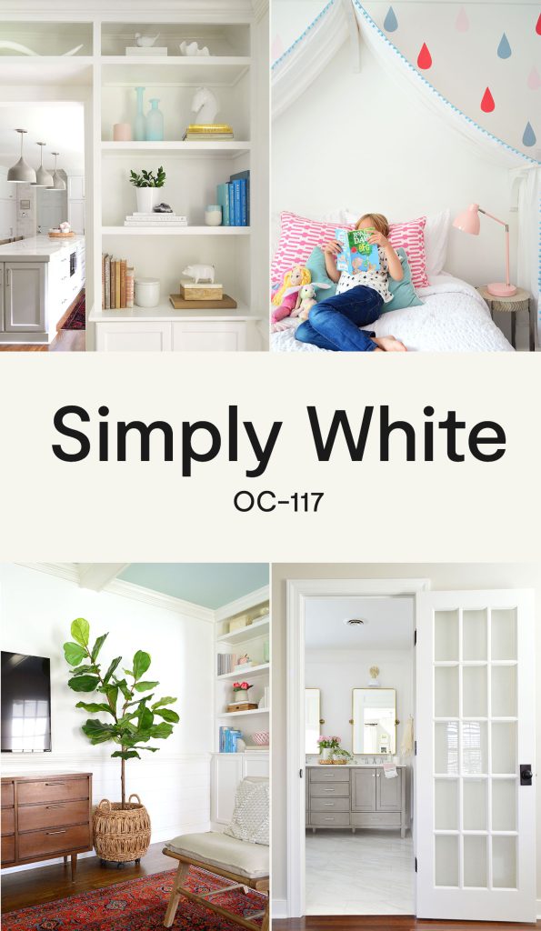
White paints can be complicated. And believe me, we’ve tried more than a few over the years. Over a decade ago, we finally landed on Benjamin Moore’s Simply White (OC-117) as our favorite go-to white paint. It’s a warm and bright white that we put everywhere: walls, trim, doors, and cabinetry. Case closed, right? Well, it’s not quite that simple…
What makes BM Simply White a popular white?
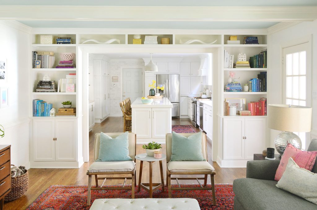
Picking the perfect white paint for your home is hard because a true “simple” white doesn’t exist. And even if it did, you wouldn’t want it on your walls! The best white paints typically have hints of black and subtle colorful undertones like yellow, green, or pink. You may not notice these hues at first glance, but they’re the qualities that keep white paints from looking too stark or too blindingly bright in your home. It’s also why there are seemingly endless options to sort through.
Simply White has earned a reputation for being one of best white paint colors out there. It was even named Benjamin Moore’s 2016 Color of the Year due to its popularity and versatility. Designers turn to it when looking for a bright, warm white that can be used on just about any surface in a home. But after using it for so long ourselves, we have discovered it does have drawbacks.
Is Simply White warm or cool?
BM Simply White is a distinctly warm white, making it a good choice for walls, trims, cabinets, and more. Cooler whites often make interiors appear stark and sterile, so most experts prefer warm whites instead. It’s also the reason we chose it as the trim color throughout our entire home. We knew it would be the perfect complement to the greige paint we used on many of our walls, Edgecomb Gray (HC-173).
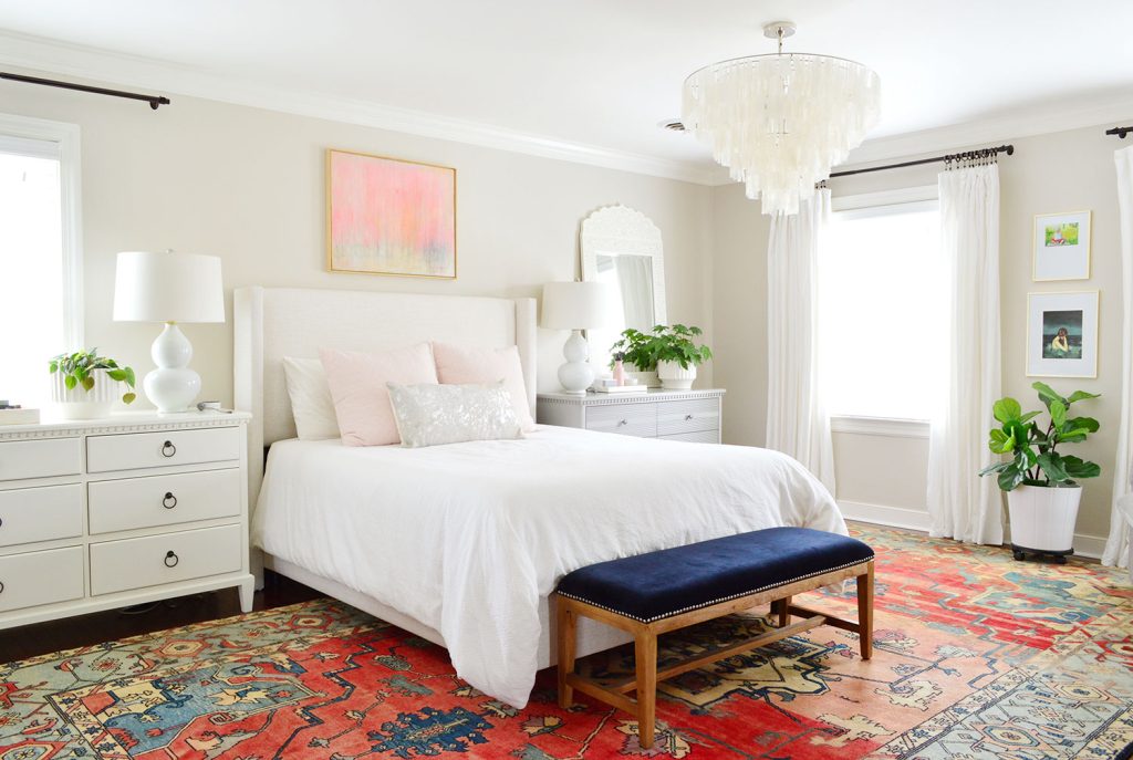
You can also imagine how a cooler white paint might clash with many of the warm tones in our bedroom – like the rust-colored rug, light taupe headboard, and off-white dresser.
What is Simply White’s undertone?
Simply White has visible yellow undertones. This is what gives it the subtle (but distinct) creamy warmth many seek in a white paint. The yellow undertone isn’t strong enough to veer it into off-white territory, but in certain lighting (like rooms with low or artificial light) the yellow can become more pronounced. For many, this makes Simply White a great, cozy white.
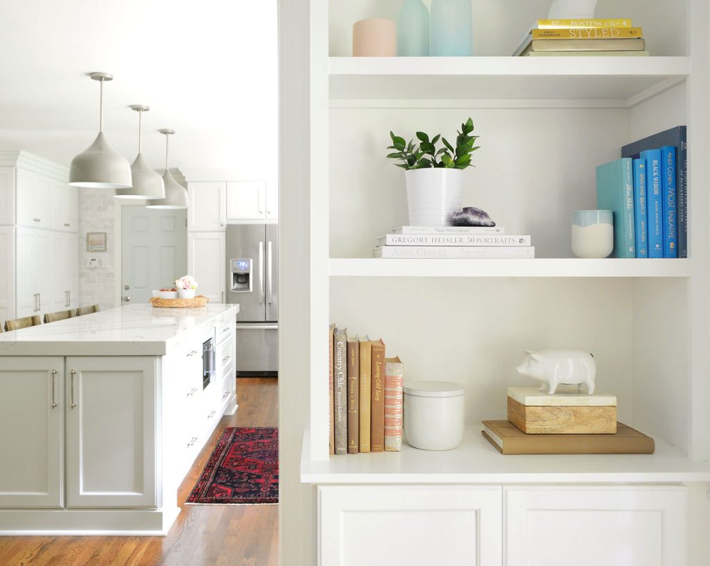
In the photo above, you can see the yellow undertones of the built-in bookshelf, which appear warmer than the kitchen cabinets in the background. Those are a cooler, stock-white finish.
Does Simply White look dingy and yellow?
Simply White can sometimes appear too yellow for some people. While it’s bright enough to avoid looking dingy, it can look off-white or cream in certain circumstances. So if this is something you’re concerned about, we recommend using something like Sherwin-Williams Pure White instead.
In our experience, Simply White looks yellowest under these circumstances:
- In north-facing rooms with little natural light
- When paired with cooler wall paints, accent colors, or wood tones
- As paint ages and yellows over time
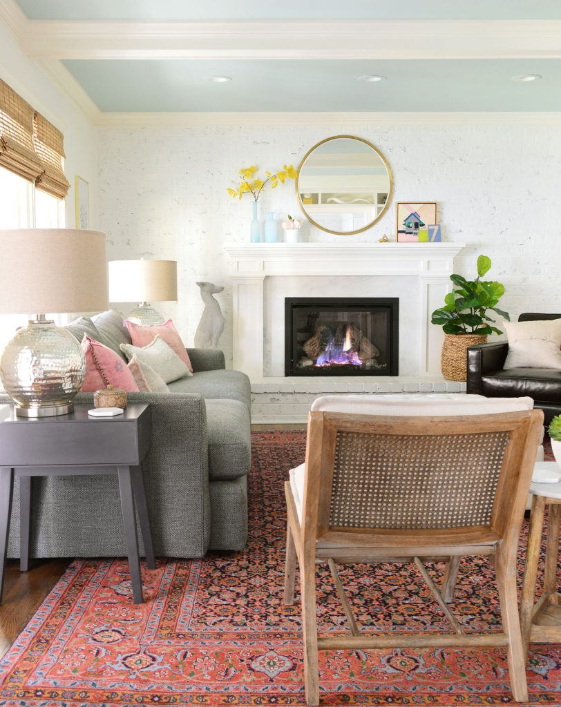
We learned some of these lessons the hard way in our living room (below) which experienced a bit of all three. The beams, walls, and fireplace are all painted Simply White. The ceiling beams were especially prone to a yellow appearance since they received the least amount of natural light of any surface in the room. Look at the ceiling trim in the top left corner of this photo:
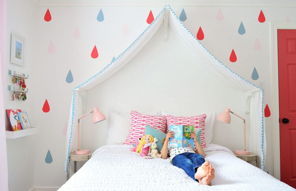
To avoid this pitfall, we found Simply White worked better in brighter south-facing rooms – like our daughter’s room below. By using it on the trim as well as the walls, the whole room achieved that crisp white look we wanted.
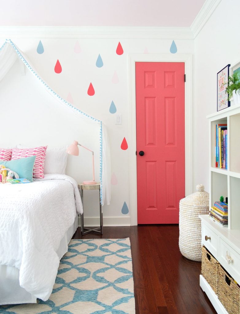
We did eventually repaint her walls a soft greige (BM White Heron OC-57). Not because we disliked the white walls, but because we were giving her room a general refresh as she got older. The trim remained Simply White because it worked so well as a crisp contrast to her colorful door, pink ceiling, and taupe walls.
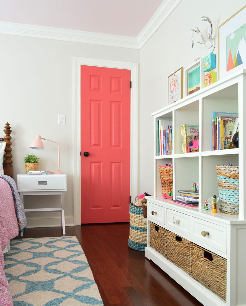
Simply White worked well for us in the home pictured in this post. But its tendency to look too yellow in certain lights caused us to move away from it in our current home. This is the white paint color that we prefer to use now.
What is the LRV of Simply White?
Benjamin Moore Simply White has a Light Reflective Value (LRV) of 89.5. This number is a standardized way to measure the amount of light a surface reflects, with 100 being the highest (pure white) and 0 being the lowest (absolute black). It is a useful metric when comparing paint colors, especially white tones. With a score near 90, Simply White is one of the brighter white paint colors available. That’s how it achieves that crisp, clean white tone that people seek.
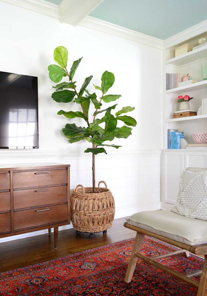
This high LRV also makes it a good candidate for lightening up spaces that tend to be dark, like closets, hallways, or bathrooms.
Where should you use Simply White?
This white paint has many good qualities that make it a strong candidate for lots of uses, so let’s go over a few.
Simply White as a trim paint color
In our experience, Simply White works best as a trim or molding color in rooms with other warm undertones. It provides that crisp white contrast that helps other accents in the room pop, like taupe walls, traditional rugs, honey toned woods, and warm metals.
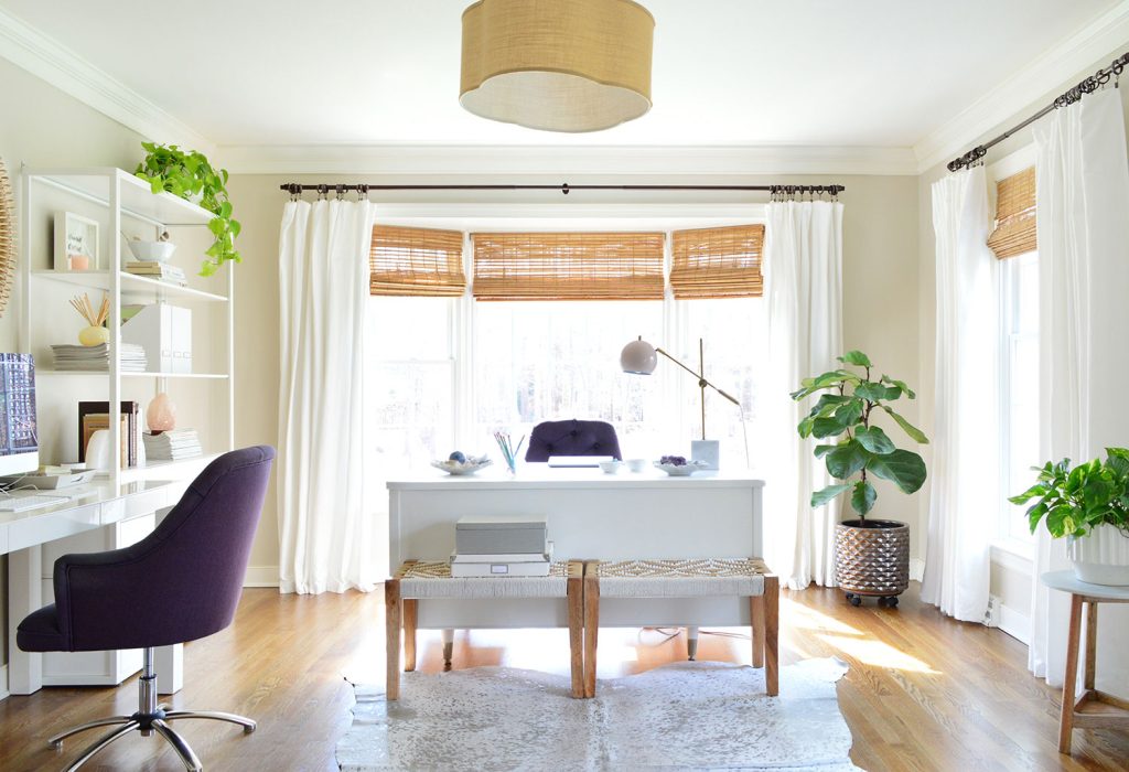
In the home pictured above (our previous home), Simply White is used as a whole house trim color. It’s an easy, no-brainer choice for trim.
Simply White as a wainscoting color
Simply White is a fantastic crisp white for decorating moldings and wainscoting, like the one we chose for the dining room shown below in a showhouse that we designed. It was also used for the trim and ceiling in this space. It’s a great trim choice for highlighting your wall color or other colorful accessories. For example, we paired it with deep warm gray walls, Benjamin Moore Kendall Charcoal (HC-166) and colorful art.
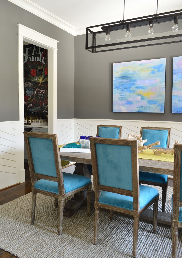
We recommend using high-quality paint like Benjamin Moore Advance for trim, wainscoting, cabinets, and doors. Lower-quality paints can yellow faster and intensify its inherent yellow undertones.
Simply White as a door color
We love Benjamin Moore Simply White as an interior door color as well. It will give your doors a clean, crisp appearance without leaving them looking unpainted. It is a fantastic option for a classic bright white door that will pop against other surfaces in your room. You can see below how we used it on this frosted glass door to our bathroom in our former home.
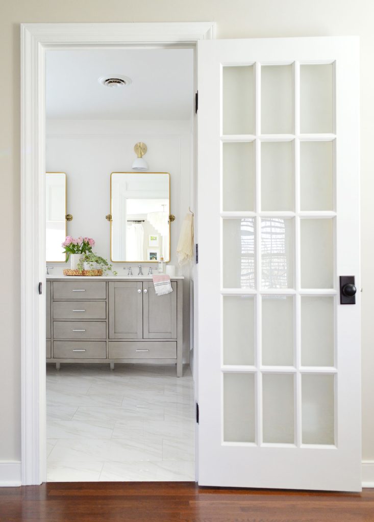
Be careful when using Simply White on exterior doors, though. Out in direct natural light, bright whites like this can appear too stark and blinding. For exteriors, we recommend white paints with a lower LRV, like Benjamin Moore White Dove (OC-17) or Benjamin Moore Snowbound (7004) (which we used on our former home’s trim).
Simply White as a cabinet or built-in color
Using Simply White on cabinets is a great way to achieve that classic white kitchen look. The same goes for built-ins like bookcases, pantries, closets, and mudrooms. Its yellow undertones keep cabinets and built-ins from looking cold or gray, white the high LRV still provides a bright, crisp white.
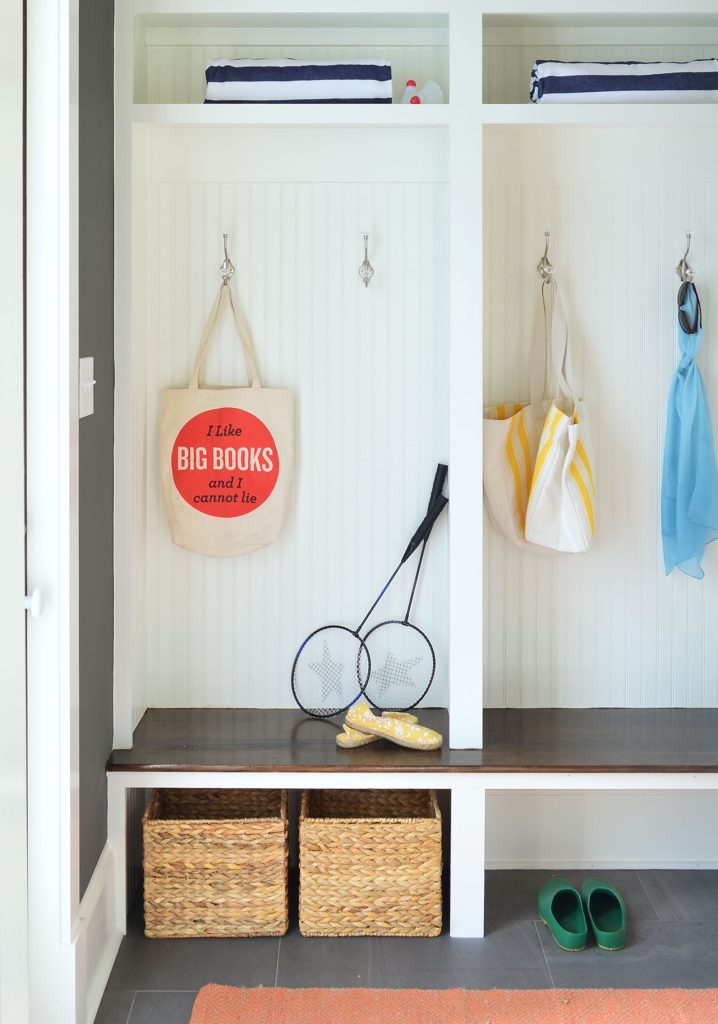
But remember that in north-facing rooms that tend to be darker, Simply White can appear slightly creamy or yellow. This extra warmth can be a benefit to some, but if you prefer a white with fewer undertones, consider Sherwin Williams Pure White (SW 7005) instead.
Simply White as a wall color
Benjamin Moore’s Simply White can be a tricky wall color. In many spaces, it’s a great way to get a clean, modern white that’s still warm enough to feel stark. We especially love it in rooms that are south-facing or receive good natural light. In our daughter’s room, it was the perfect backdrop for a colorful, playful kids room.
The tricky part is when Simply White is used in lower-light rooms or spaces featuring cooler colors, like this home office from our Showhouse below. The porch outside this room caused it to be darker than we expected, and when paired with the blue ceiling, Simply White looked yellower than we’d hoped – you can especially see the yellow undertones in the doors in the photo below:
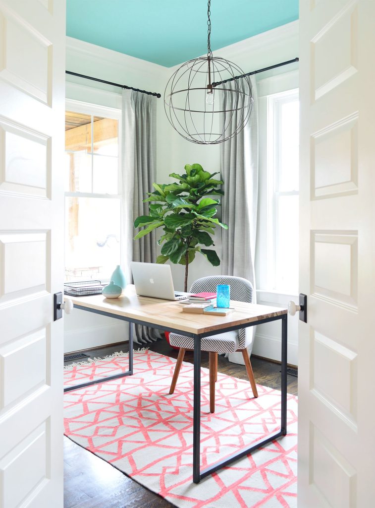
Bright white walls also tend to reflect the colors around them, like in accent walls or bold furnishings. You may notice the teal ceiling casts a bit of green at the top of the walls in the office above. While the roses and pinks in our daughter’s gave Simply White a reddish undertone.
Simply White as a whole house color
Simply White is a good whole house color if you’re comfortable with is variation in different lighting, particularly its tendency to look creamy and off-white in lower light. We used it in the open-concept living room & kitchen of our Showhouse. It gave the house the bright, modern, and colorful aesthetic we were seeking.
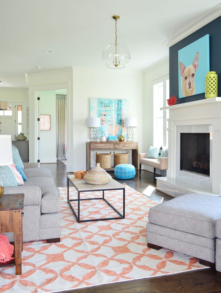
You can see more rooms in this Showhouse we designed by watching the video tour below. It may give you a better idea of how Simply White performs as you walk through the open living space.
Note: You can also watch this video on YouTube.
For our current home, however, we decided to choose a whole-house white paint with less noticeable yellow undertones. It’s now our top recommendation for a whole-house white paint color.
Comparing Simply White to other popular whites
Another way to decide if BM Simply White is the right fit for your home is to see how it compares to other popular white paint colors that experts use over and over again. As you can already see, slight differences in undertone or brightness can make a big difference.
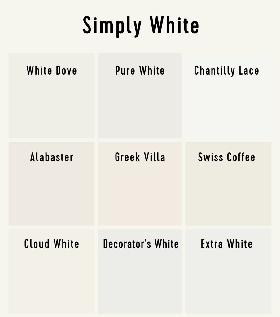
We are using the paint manufacturers’ web colors to compare these white paints because they provide an apple-to-apples contrast. However, it’s recommended that you test a new paint color on your wall before painting your full space. You can also order pre-printed paint sample stickers, which is a quick, easy, and affordable way to test these popular white paint colors:
Simply White vs White Dove

Benjamin Moore’s Simply White and White Dove (OC-17) are often suggested as alternatives to each other. White Dove has very similar yellow undertones, but its lower LRV (83) makes it slightly darker. That means it may appear as a very muted tan or light warm gray in some spaces. It is a great substitution for anyone who worries Simply White is too bright or stark for their taste.
Simply White vs Pure White

Sherwin-Williams Pure White (SW 7005) is similar to Benjamin Moore’s White Dove. It too is darker than Simply White, which prevents it from looking too stark or bright. However, its beige undertones are much subtler, so it reads closer to a true, clean white. Use it if yellowing is a concern for you, or if you have cooler tones in your space. We have more information about why Pure White ranks as one of our top white paint colors.
Simply White vs Chantilly Lace

Benjamin Moore Chantilly Lace (OC-65) is Simply White’s cooler cousin. Cooler, as in it has slightly gray or blue undertones. It is just as bright and crisp, but without the hints of yellow. It pairs well with other cool-toned decor, but in some spaces may lack the coziness of warmer whites.
Simply White vs Alabaster

Sherwin-Williams Alabaster (SW 7008) is quite different from Simply White. It is much darker and noticeably warmer, giving it a distinctly off-white or beige appearance. The two share similar undertones meaning they would work well together, like Alabaster walls with Simply White trim.
Simply White vs Greek Villa
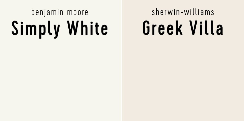
Sherwin-Williams Greek Villa (SW 7551) is another popular off-white that can be paired with Simply White. Both have warm undertones that complement each other, but Greek Villa has some hints of red that can give it a slight pinkish hue in certain lighting. Consider Alabaster as a muddier alternative if you’re looking for a light greige.
Simply White vs Swiss Coffee

Benjamin Moore Swiss Coffee (OC-45) is another great complimenting color to Simply White. It is a bit darker and has hints of green, which can cool its warmth ever so slightly. It is still firmly in the warm white category, and may even tip over to off-white or light beige, especially if paired with a brighter trim white.
Simply White vs Cloud White

Because Benjamin Moore Cloud White (OC-130) is slightly darker and slightly creamier than Simply White, is more likely to appear like an off-white in your space. We suggest sticking with Simply White if you’re seeking a true warm white, but consider Cloud White if you’d like a classic antique white feel or have lots of warm finishes in your space.
Simply White vs Decorator’s White

Benjamin Moore Decorator’s White (CC-20) is a distinctly darker and grayer white than Simply White. Because of its slight blue undertones, it doesn’t run the risk of looking yellow and can pair well with other cooler-toned paints. However, it may appear too gray for some. A brighter white like Chantilly Lace may be a better cool alternative to Simply White.
Simply White vs Extra White

Sherwin-Williams Extra White (SW 7006) is another great cool white alternative to Simply White. Is it slightly darker, but still appears like a crisp white when used on walls, trim, or cabinets. It doesn’t have strong undertones, which also makes it a flexible white choice if you worry about Simply White’s tendencies to look yellow.
Final considerations
Benjamin Moore’s Simply White is a solid choice for a bright warm white. We used it throughout two different houses: on walls, trim, doors, cabinets, moldings, and more. In doing so, we bumped into some of its drawbacks and limitations. It tended to look creamy and off-white in rooms without good natural light. And after several years, the inevitable yellowing of old paint compounded this issue.
So as much as we swore by Simply White for so long, we moved on to a white paint we like better for our new house.
More paint colors we love
You can check out more of our favorite, go-to paint colors by touring our homes in the menu at the top of our blog (here’s the home featured in this post) or browsing our Painting Projects section. We’ve also written deep-dives on some of our favorite paints:
*This post contains affiliate links, so we may earn a small commission when you make a purchase through links on our site at no additional cost to you.
More posts from Young House Love
[adinserter block=”2″]
Credit : Source Post


